Designing visual strategy and product UI experience for cloud communications platform
The Company
Client:
Plivo Communications,
San Franscico
Services:
Visual Strategy, UX + UI Design for SaaS Product, Website Design
Project Brief
Founded in 2011, Plivo is a #2 communication platform globally that enables businesses to connect, engage and interact with their customers.
We worked closely with the founding team of Plivo to re-establish a visual strategy for the fast-growing company. The first step was to think afresh, gather data and research thoroughly on the idea of simplifying telecommunications. We revamped Plivo’s Visual Strategy, Marketing Website, Administration Console and designed web Interfaces of their latest product.
Our Approach
- Establish a Visual strategy that works well with other brand components like brand logo
- Create a set of brand guidelines as a part of this exercise
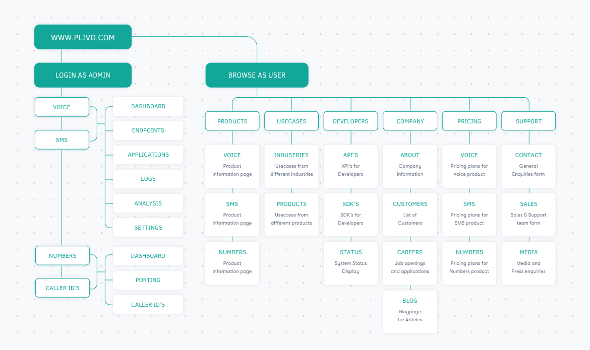
- Create Information architecture & task flows for website, followed by wireframes
- Finalise the communication & visual assets for the website design, website launch
- Wireframes & UI structuring for PHLO - Plivo high level objects
- Finalise the visual design for the product interface
The new Visual Language for Plivo
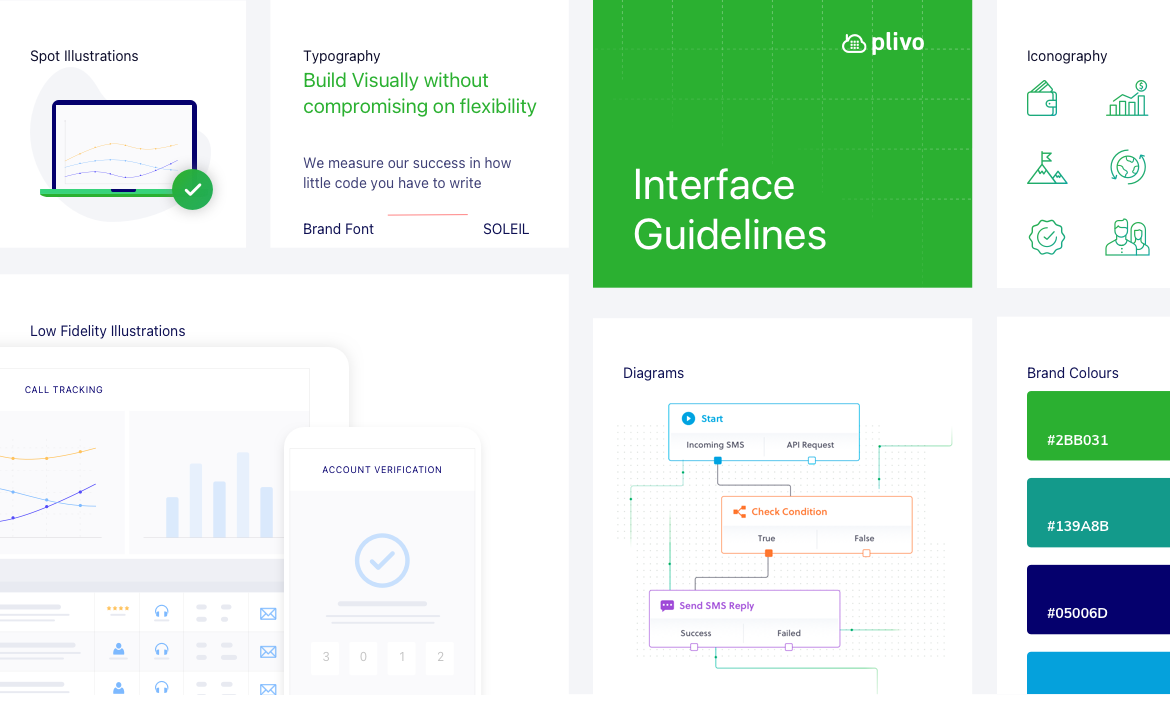
Plivo’s growing range of Products & Services needed a better and vast visual library as the existing components were not enough to communicate Plivo’s portfolio in an appealing manner.
We built a simple, consistent and easy to use Brand library full of components that can be easily used by marketing, design, product & code teams throughout the company. This included types of icons, illustrations, font & colour palettes, and other UI components.

Website Revamp
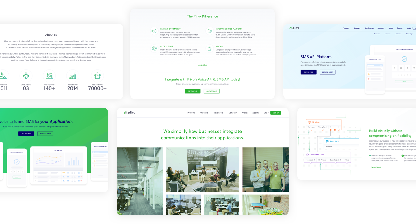
Once the visual strategy was established, we worked on creating the website architecture. We restructured different pages, added new pages & created a coherent structure for the website. Once this was done, we worked on writing precise content & creating layouts based on this content.
The Final designs were crisp, neat & on point. Ample graphics were provided to help make textual content easy to understand + add the visual appeal of the site.
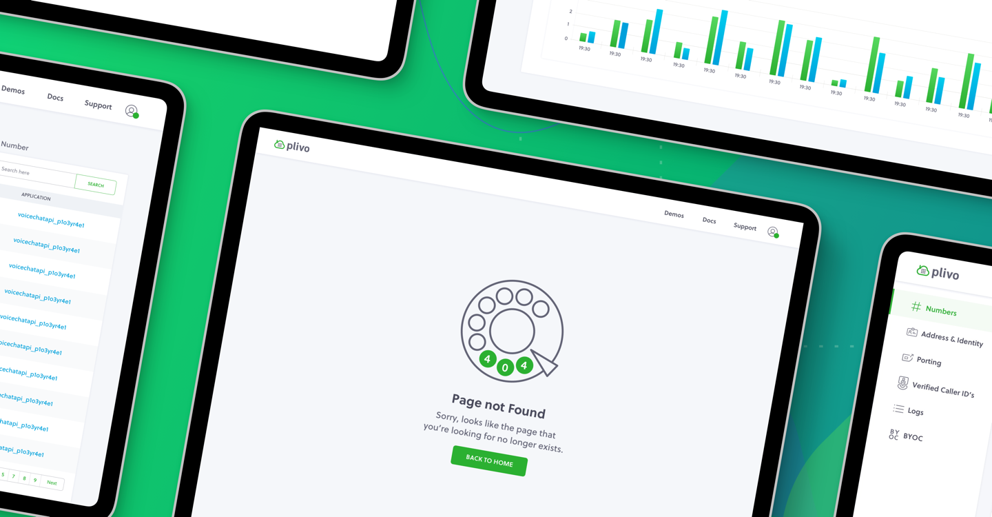
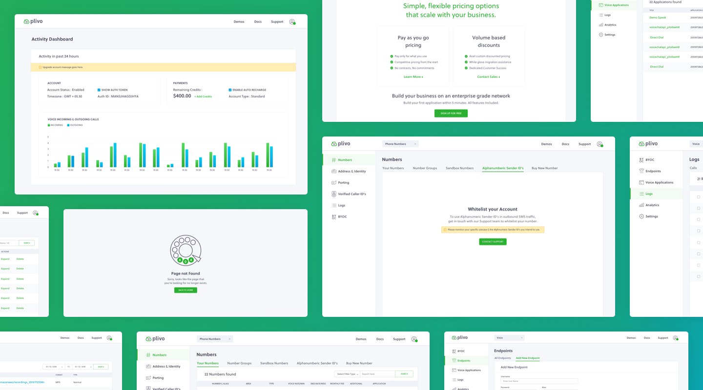
Designing Plivo’s Management Console
Once we were done with the website design, we moved on to designing the management console for Plivo. This console helps a admin/ registered user manage their daily tasks within account, track their purchases, billing, subscriptions, use paid features, etc & more.
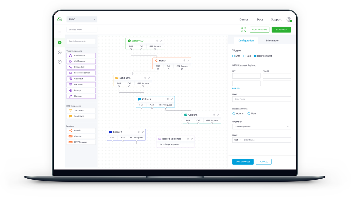
Designing Plivo’s Product Experience
Following the console design, we started work on designing the Product interface for PHLO - Plivo high level objects. This product enables simplified communication integration by simply letting the user drag & drop elements.
The product has a complete drag & drop interface & relies heavily on correct placement of elements so as to make it intuitive to use. The components to be used to create different tasks are kept on one side, with an action area/ canvas at the centre, while the most used part of the screen - the right side is reserved for settings against each task.
The Design Impact
We worked closely with the Plivo team for a duration of ten months ~ including Visual strategy, Mobile responsive web interface design and Product Interface design. Co-founder of Plivo, Venky, was personally involved in the project and the end product of the project was possible thanks to his inputs!
80+
Web & Mobile Screens
450+
Completion Days
200+
Visual & Other Assets