Making Fintech B2B fun ~ Brand, Visual Strategy and Product redesign for Recko (acquired by Stripe)
The Company
Client:
recko.io (acquired by stripe) Bangalore
Services:
Brand Identity, Visual Strategy, UX + UI Design for Web Product
Project Brief
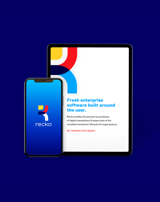
Recko (short for Reconciliation) enables AI-powered reconciliation of digital transactions & keeps track of the complete transaction lifecycle for organisations. Recko aims to monitor every transaction in the world to ensure the right money moves between the right parties at the right time. Through thorough research & interactive sessions with the team of Recko, we helped build a clear narrative of the brand — it’s identity, persona, story, market placement, mission, and vision. In addition to this, we also worked on the product screens of the web product of Recko.
Our Approach
- Create a Brand Identity for Recko through it’s logo, colours, fonts
- Establish Visual Strategy through Icons, Illustrations, Patterns, UI elements
- Strategize look & feel for the product UI + draft UI guidelines
- Final Interface design for 15+ screens
Building a Brand Narrative
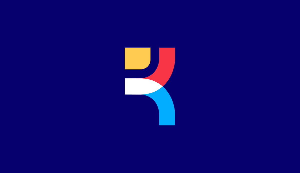
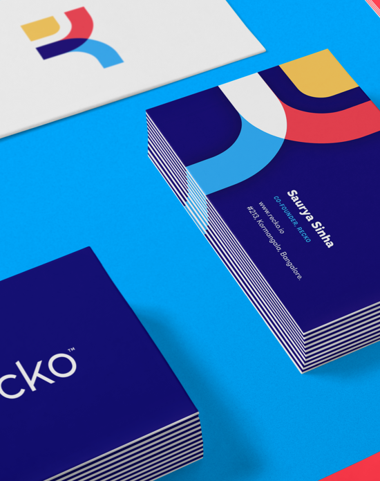
Addition, Subtraction, Multiplication, Division are some of the core essentials of any transaction whereas Reconciliation is basically making financial accounts consistent.
The visual symbols of these elements ( plus, minus, multiply, divide & equal to ) are combined with the name Initials to build the Recko monogram. The overall Visual Identity has a geometric look & feel to it so as to make it sharp, dynamic, fun & bold.

Scaling the Visual Identity for Interface
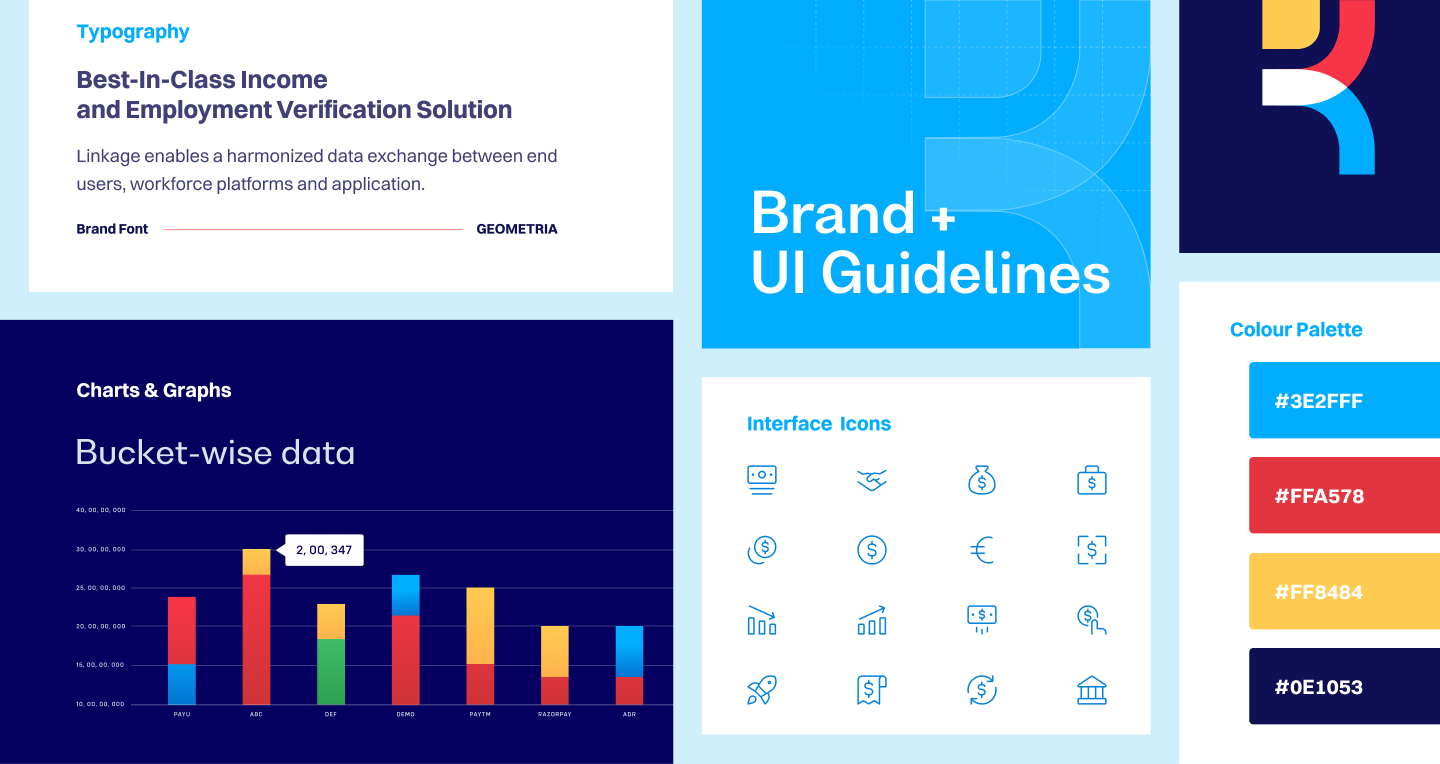
Keeping the newly established Identity in mind, a whole new set of UI elements were designed so as to keep the identity consistent throughout Brand’s digital touch points.
We designed a new set of Interface & In-App icons, graphs and other visual elements in geometric style to be used in the Recko’s customer product and other interfaces
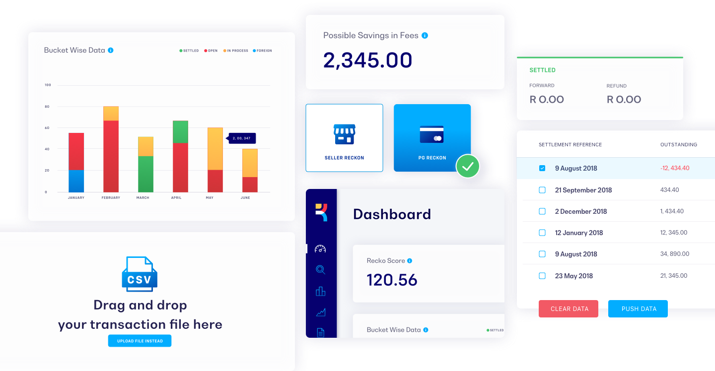
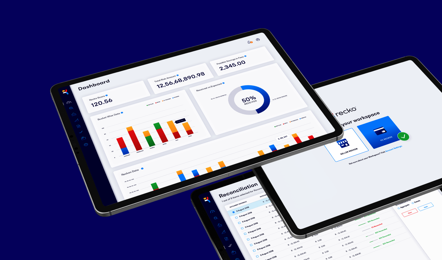
Designing the Product Interface
Our team believes in making B2B fun and we’ve followed the same belief in Recko’s Interface design. We’ve made the screens consistent with the new Brand Identity while also making it visually fun by adding bright colours to the UI, through creative empty screen messages, icons, and other such detailing. Around 10 screens were designed which included screens like Sign up/in/out, Dashboard, Reconciliation, List of Transactions etc.

The Design Impact
Working with recko was a fun experience. The complete redesign project was completed in 2 months and we worked closely with the recko team to implement the redesign seamlessly in their marketing & product efforts.
28+
Visual & Other Assets
24+
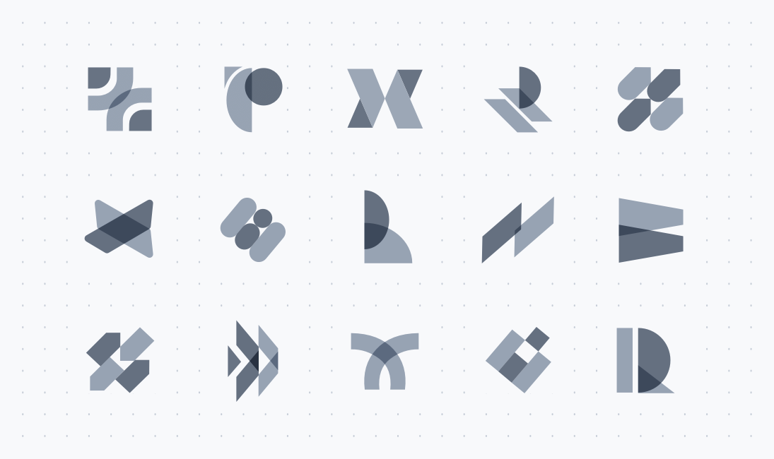
Monogram Explorations
48+
Completion Days